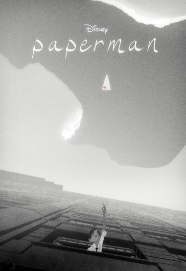
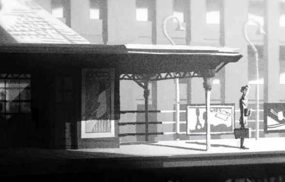
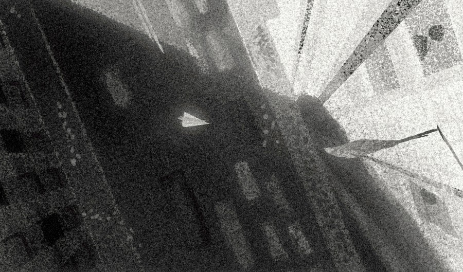
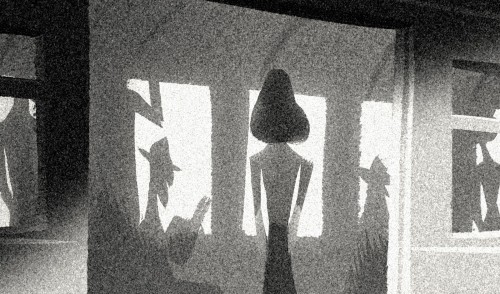
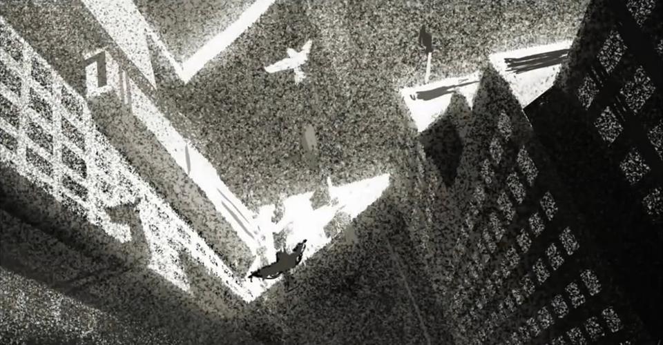
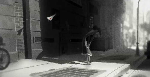
During our photoshop drop in lesson today Alice and I had a good chat with Photoshop Phil about the direction our concepts were going in. We told him about how we would like a graphic design propaganda style to fit in somehow, being quite 'vintage' in ways. Also that we really like the way black and white has been used in research we have carried out already, contrasting against specific strong colours. Phil pointed us towards Disney's up coming short 'Paperman' which we have been using as inspiration in our paintings since.




Good choice - There is a promotional "Paperman" book in the office if you need it.
ReplyDeleteThanks Alan I'll make sure to take a look :)
Delete